 Advertising is the difference which can allow companies to flourish beyond initial contemplation if it is done right, and the inclusion of LED signage is a must for obtaining the best of this technology for your company. Science has always suggested that lights which are alive can garner a lot more attention than posters and signboards with printed material on them. Using this very factor, the following aspects make LED signage the future you must step into to allow people maximum exposure to your company on the roads. 1. Flexibility Once you print a static signboard, it’ll stay that way forever until it is intentionally/unintentionally destroyed. Any alterations you wish to make on the same poster will result in it losing its credibility and originality. In comparison, once you install an LED signage system you can alter it anytime you feel that the displayed message is becoming stagnant or is not fulfilling its purpose. This means that after the initial investment, subsequent changes will be a lot easier to bring about. 2. Visual Attraction While out on the streets it is not very easy for people to keep track of everything that they find outside their vehicle. In the massive plethora of boards which come about in the drive, the one which attracts the potential customers the most is the one which has some visual reality present. In contemporary times, LED signage is the only way any company can gain an absolute advantage over others not deploying it for marketing purposes. What’s pleasant to the eye is often quite pleasant to purchase as well, which means that if your signage happens to be near a busy traffic spot in a commercial area, the attraction can act all the way to the doorstep of your outlet. 3. Seen from Afar This is one benefit that traditional boards cannot come attached with. Regardless of the size of the boards, unless they have some distinct glow to them which can make the visible from distances, they will serve no purposes for people driving on the other side of the city. Although it is quite unrealistic to assume that the board will fall in the sight of everyone passing by, the increased exposure will serve as an incentive for individuals to try your outlet. 4. Exposure to Creativity The creative department in any organization is usually limited by the static appearance of the boards. That is because simplicity and easy interpretation are two factors which govern most advertisement boards because otherwise, it is really difficult to get any message across. Innovation can show its true colors in LED signage, however, because people can use their thinking to carry on the message of their organization in unique ways. An example can be one signage showing two messages simultaneously, without interfering with each other. Finally, for business owners, it is quite a turn off considering the expense in the initial stages. However, LED signage can be altered in any way the creative department deems necessary, which makes it a great step forward for marketing purposes. Posted by Randy Blakeslee - GetnSocial 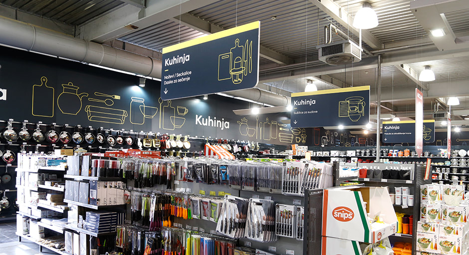 In this age and date of technological advancement, people hardly get time for anything, they want everything to be done as fast as possible. Especially when you go for some retail therapy. The most difficult part of big retail outlets is to search for a certain item or search for a certain section. This is where Wayfinding comes in. Wayfinding, as the word itself states are signs to help people find the way or any item. The saying signs have been used for more than 30 years and started off as the basics, ‘Stop’, ‘Start’, ‘Stairs this way’ ‘Elevator this way’ and many more. They are used everywhere; hospitals, offices, roads, subways, metro stations and retail outlets. They come very handy in retail outlets when you are buying stuff such as groceries, sanitary, food items, clothes, shoes and miscellaneous stuff. Wayfinding, if done right in the retail business is a very profitable investment for the retail sector. The important things to consider in retail wayfinding are as follows: 1. Clarity The wayfinding sign should be clear and easy to understand. It should be written in bold letters with a plain or dark background so that it is easy for everyone to read and understand. The sign should be big and bold in size so that it is visible. 2. Placement The placement of the wayfinding should be in a place where it is visible from all 4 sides and everyone is able to see the sign. There should not be any obstruction or hindrance in front of the sign which makes it difficult for customers to locate the sign. 3. Planning When you are planning and designing your retail outline, keep in mind the wayfinding signage and plan and construct your outlet accordingly. When the customers will find your outlet easy to navigate then you will get more potential and loyal customers. 4. Language This is also an important feature and depends country wise. Make wayfinding signs in your native language as well as consider the English language for tourists and visitors. 5. Effective Using wayfinding signs where they are not needed will not be helpful for your retail business but using signs in all the effective places with consistency and in a continuous way will be helpful for the customers in finding the directions. 6. Illumination You can also use the technology of LED lighting and illumination to make your signs more attractive and visible. 7. Wayfinding Signs Nowadays, everything has become digital and wayfinding signs are also competing in the race. The new technology of digital touchscreen wayfinding signs is extremely helpful. You can navigate huge shopping centers with the click of your fingers. You do not need to be distressed if you cannot find the washrooms, play areas or food courts. You can enter your location and get the whole map through which you can be guided to anywhere you wish to go. You will be shown the whole of the outlet with the exact location of each shop and the shortest exit way as well. Posted by Randy Blakeslee - GetnSocial  'Without advertising, you can never promote your business or express yourself.’
Everyone knows this golden rule of getting famous, but not everyone gets to enjoy the spotlight. Today we will focus on the usage of website for digital signage. Happy Reading :) 1. Identifying the Cause’ And ‘Effect’ Before designing your sign, you need to ask yourself:
2. Linking Content with Your Desired Sign Good written content is the heart of signage industry. But sadly, not everyone can write good content. A good marketing strategy is to link your words with what your business or what your message is all about. For example, if you run an automobile business, your tagline should have words like ‘wheels, cars, bikes, and road.’ Even if you aren’t using the words directly, you need to create a connection with the message because these types of techniques greatly influence the sub-conscious part of mind. 3. Color Scheme Humans are visual oriented creatures. Before the reading a message, they will be the first to recognize the color scheme along with graphics and illustrations. You can go with multiple color schemes. Either pick bright colors which are attractive in nature, so that if anyone visits your website, they will be attracted to your sign. You can also use the same color strategy of your website’s layout on your sign to have more symmetry but don’t be too obvious, otherwise it will be difficult to distinguish your message from layout. 4. Website Ad Plugins There are over 100,000 plugins in different website platforms. Why don’t you use them to increase your optimization? Browse through hundreds of ad plugins and see the power of making your ad more productive. Good examples include Ads pro plugin, WP pro ad plugin and WP quads. The two mentioned foremost i.e. Ads pro plugin and WP pro ad are unique in a sense that most people use ad blockers to bypass signs. Ads pro plugin will nullify the effect of ad blocker and WP pro ad is a complete ad manager of your website. It will give valuable statistics as well as directs you towards the best places of placing your ad. 5. Using Pre-Built Layouts Yes, you can use them. The plus side is that you don’t have to work very hard. Just pick up a template and improvise on the design but the downside is that they are publicly available to everyone. (But, that is again subjective. Being openly available in the market means people are using them to set trends) The best approach probably, is to use pre-built layouts and then use appropriate innovation so that people can differ between you and other brands.  Adding some flags to the next tradeshow setup or big promotion to your business is a good way to build brand awareness and improve your visibility. However, a lot of people don’t consider this and lack confidence in being able to create quality flags. Such people tend to think that great design is a matter of taste and taste is innate quality that some people lack. Yet, they are wrong. Good design is all about adhering to basic principles and knowing how to bend rules. All of these can be mastered and learned with dedicated practice and study. You may always skip the hassles and hire a signage service provider. Yet, having a little background knowledge makes collaborative design process more gratifying. With this in mind, there are some flag design tips that you will boost on the fundamentals. Flag Design Principle #1: Use Meaningful Symbolism – The symbols and colors you pick must be symbolic, which relates to the meaningful parts of the country, state or city. Again, it works on the business level. Just take McDonalds as an example whose Golden Arches basically refer both to the unique signage and shape of the restaurant and the shape and color of the food chain’s signature fries. Get rid of the stock symbols and consider seizing each branding opportunity. Flag Design Principle #2: Keep Everything Simple – It suggests that your flag design must be so basic that a kid could draw it from memory. While it’s a good piece of advice for the national flag designers, it is also pertinent information for the business owners building their brands. If you like you flag to leave lasting impressions, consider going for something austere. Flag Design Principle #3: Be Distinctive – The uniqueness is something that each business owner must strive for in the flag design. As a business owner, the last thing you like is for the flag to evoke the thoughts of someone’s brand. While this can be tempting to borrow what is working already for somebody, resist the outside influences and make something that is definitely your own. Flag Design Principle #4: No Seals or Lettering – Experts recommend that state, city, and national flags use no writing or lettering of any kind. For their purposes, they are right. If you have to write in the thing’s name you are trying to represent, your symbolism failed. Business owners have some leeway, yet only if they are mounting their flags indoor. Lettering does not work on the outdoor flags for same reasons that complicated detail and design won’t once the wind starts blowing and the legibility drops. Combine this with the fact that majority of the flags are viewed from a certain distance and the issue will be clear. Flag Design Principle #5: Use Two to Three Basic Colors – Try limiting yourself to what is known to as a standard color set that includes white, red, black, yellow, green, and blue. Even if those principles were written without some businesses in mind, they convey something important about the design theory that you would have to know before you could make the most ideal design. Posted by Randy Blakeslee - GetnSocial  If you have managed or run a business for a few years, you may be forgiven for getting a bit complacent. It takes so much attention and effort to detail to get the business running and up. When you get into the groove, you’ll tend to let particular things slide. If you aren’t turning profits on a regular basis, it can be a huge problem. Yet, even though you’re in the black, you could not be making as more revenues as you might if you’re a bit vigilant in your business upkeep. New Signs and Old Signs Your sign might have looked good 2 years ago. It might’ve been exactly what you wanted and might’ve been good for business. Indeed, the sign’s content might still be what you like, yet how does the sign looks? Is your sign tired and old? If your answer is yes, your signage must be updated or replaced. Once you answer maybe, your sign must be updated or replaced. The reason behind it is that a lesser optimal sign means lesser optimal revenues. The cost of the new signage might be quite small in comparison to the increase in the business. What does a faded and old sign say about your business? In the world where people are searching for what’s different, new, and trendy, it does not pay to behind times. Although you have a business that’s established since 1800s and prefer to convey history and stability, old sign does not say historic as it says neglected, won, and tired. It does not say old school, it only says old. What Are the Stats? You might want to know some stats to back up their claims, lest you think they are cynically trying to improve business revenues. But, there’s nothing to worry about since the stats do support the argument. According to Sign Research Foundation, it was found that sixty percent of the businesses reported an increase in the average sales of ten percent or more through updating or adding their signs. 6 out of 10 businesses improved their revenue simply through updating or adding their signage. Not just increased sales, yet increased by ten percent or more. That’s a particular amount. Just check the sales today. Would you increase it by a tenth? Well, you could? If you doubt that you won’t be able to get these revenues, the first thing that you should get is high grade and professional quality signage at a reasonable price. It isn’t like you need to put out this huge outlay to get another signage. So, it isn’t a huge gamble. In addition to that, those businesses that have seen an increase of at least ten percent. Others saw higher increases and most of the businesses in forty percent might have increased sales, not by this particular margin. But, there’s nothing to worry about as it cannot hurt to have clean, crisp, bold, and new signage in your business or in storefront. It would make your business appear more impressive no matter what the effects on the sales. Posted by Randy Blakeslee - GetnSocial |
Quantum Sign CorpWe bring life and lights to signs. We would love to share our news with you. Archives
January 2020
Categories
All
|

 RSS Feed