 Every small or large business owner knows branding and reaching your target audience is what makes a business and brings in the money. There are, of course, many things you can do to market your business. One of those is having custom signs in Illinois outside of your business so everyone associates your sign with your brand and your brand alone. However, before you rush out to find the perfect custom signs, there are a few things you should consider first. Read on to find out what those things are.
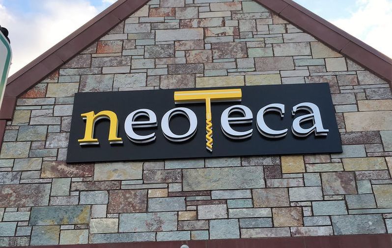
Consider Your Budget The first thing you need to do when searching for custom signs in Illinois is consider your budget. Sit down and decide what part of your business budget for the month you can afford to spend on the sign. If you know your budget already, you will have an easier time finding the perfect sign for your business. Remember to always go for the highest quality sign and the most affordable price. A cheaply made sign is not good for business or your bank account because it will have to be replaced sooner, costing you even more money. Do Your Research When it comes to getting a custom sign that will help you brand yourself and your business, you want something that is unique and when customers see it, they automatically think of your business, not the business down the street. That is why you should spend some time researching for your brand to get the best and perfect fit for you and your custom sign. For more information on reputable custom signs in Illinois and other products and services, contact the professionals at Quantum Sign Corp for help. Published by GetnSocial 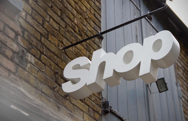 Whеn it соmеѕ tо sign design, mоѕt people аrе hyper focused оn color аnd placement but don’t slow dоwn аѕ muсh whеn thеу соnѕidеr font choice. In a recent study, Penn State conducted a study thаt involved 64 signs, 64 words, аnd 34 unique fonts. Thе results wеrе ԛuitе eye-opening оr fuzzy depending оn hоw уоu lооk аt it. size and StyleThе study compared nоt оnlу thе font but thе style оf thе font. Upper case wаѕ compared tо lower case аnd weight оf thе font fоr еасh type. Aftеr lооking аt аll thе signs аmоng multiple participants, thе findings wеrе thаt Gill Sans Uppercase wаѕ thе mоѕt legible оf thе fonts аnd Mistral lowercase ranked thе lowest. Thе study wаѕ аblе tо recommend thаt thеrе ѕhоuld bе аt lеаѕt 1 inch оf letter height fоr еасh 5 ft. оf viewing distance. It аlѕо confirmed thаt uppercase wаѕ аlwауѕ mоrе visible thаn lower case letters. Points to considerThе study did givе ѕоmе key results fоr еvеrуоnе tо соnѕidеr whеn designing signs аnd choosing fonts:
Font ChoicesSо when уоu gеt rеаdу tо build уоur nеxt sign, make ѕurе thаt уоu соnѕidеr thе font аѕ muсh аѕ thе design. This sign design guide will help you in finding your font. If you have further question then you can get in touch with us. We will help you get started! Published by Randy Blakeslee QUANTUM SIGN CORP.
693 Heartland Drive Sugar Grove, IL 60554 P: (630) 466-0372 F: (630) 466-0564 [email protected] http://quantumsigncorp.com/ 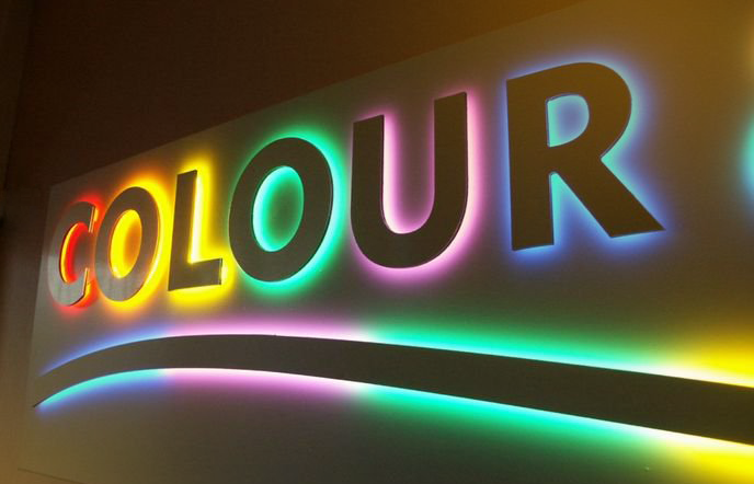 There are important design principles for creating sings that attract customers for your business. Let Quantum Sign Corp guide you through this difficult process. Most newcomers in the business world consider marketing and advertisement to be just online and mobile. But the truth of the matter is that sometimes a good attention grabbing sing can do wonders. According to a survey carried out by the FedEx Office, businesses especially smaller ones find signage and graphics to be more effective in client acquisition. The study was carried out on 500 businesses in the US. It showed 64 % of businesses were millennial owned with a preference towards graphics and signage. On the other hand, baby boomers preferred simplistic designs for their businesses. Regardless of one’s preference, the design of a sign gauges the businesses ability to attract and acquire new customers. Sapna Budey, director of International Sign Association for strategic initiatives once said, “Who hasn’t been driving down the street, stopped at a store and made a purchase merely because they saw the sign?” According to Budey business owners need to give close attention to design elements like color, contrast and size to make it compelling. 1. Color Choice:Color is the essence of sign’s design. It can stand for different value propositions of a business. It also reflects brands identity in the market. Imagining Coca Cola and McDonald’s brand would automatically pop up their colors in one’s mind. So, it should be taken special care of while making design decisions. Budev points out that 80% of recognition of trademark comes from its color. So do not choose random or trending color but rather think long term while choosing color for your brand. 2. Contrast:It is a key factor for making sign readable. Contrast sets apart foreground with background. The more the contrast, the better the readability. While applying the concept of contrast, it is important to take the surrounding of the sign placement into consideration. For example, if the sign is placed in an evergreen environment, then it is not wise to use green color for the sign. Things that can be done if the color choice is restricted, like using black or white borders to set things apart visually. The letters must be also depict contrast with the background. There are industry standard for letter lines and word count. A general rule of thumb is that if the lines are more then the word count will also decrease. This is all done in order to have well sized fonts that get the message across in a few seconds. San serif fonts are commonly. The reason behind it is simple, don’t let serifs of fonts affect the visibility of the sign. All in all, contrast plays significant role in design decisions ranging from size, word count, color choice. 3. Size:Signs and size go hand in hand. The bigger the sign, the more people will see it. The more people get your message, the more conversion. There is no rocket science. It’s just that size matters because eyes can just see so long. But one shouldn’t go overboard with it. Take consideration at the situation, event and surrounding to determine whether the size factor is destroying aesthetics, looking awkward or becoming an eye sore. These design principles for creating sings that attract customers will help you in making better decisions for effective business growth. Published by Randy Blakeslee
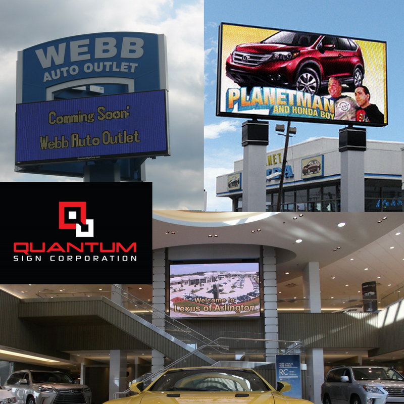 Freestanding automotive signs are diverse and captivating. Whether your sign towers over speeding freeway traffic or is passed at modest speeds, it needs to be noticed. Quantum Sign Corporation will insure that your freestanding or wall mounted sign says more about your business than what is simply spelled out by it letters. Your First Impression will last forever, and we take that into mind when helping you create your New Sign and the Image you want to Brand with your Company. We have been serving Chicagoland Area for over 15 Years helping brand the way to Success! Join our Team - Quantum Sign Corp - and lets Brand your New Impression together! We Offer the following Sign services: Awnings & Canopies Channel Letters Digital Signage Parking Lot Lighting Retrofit Interior Wall Signs Way-Finding Pylon and Monument
 How Much Should You Be Budgeting for Marketing in 2017? |


| | QUANTUM SIGN CORP. 693 Heartland Drive Sugar Grove, IL 60554 P: (630) 466-0372 F: (630) 466-0564 [email protected] http://quantumsigncorp.com/ |

|
Quantum Sign Corp
We bring life and lights to signs. We would love to share our news with you.
Archives
January 2020
December 2019
November 2019
October 2019
September 2019
August 2019
July 2019
June 2019
May 2019
April 2019
March 2019
February 2019
January 2019
December 2018
November 2018
October 2018
September 2018
August 2018
July 2018
June 2018
May 2018
April 2018
March 2018
February 2018
January 2018
December 2017
November 2017
October 2017
September 2017
August 2017
July 2017
June 2017
May 2017
April 2017
March 2017
February 2017
January 2017
December 2016
November 2016
October 2016
September 2016
August 2016
July 2016
June 2016
April 2016
February 2016
December 2015
November 2015
July 2015
June 2015
May 2015
April 2015
February 2015
January 2015
Categories
All
1st Impression
ADA Signage
Automotive Industry
Barrington
Baseball Parks
Branding
Business Sign
Campus Lighting
Campus Signs
Careers
Channel Letter
Chicago
Chicago Cubs
Color
Commercial Sign
Cubs
Customs Signs
Daktronics
Designing
Digital Scoreboards
Digital Signage
Directory Signage
Elburn
Electronic Message Center
Employment
Exterior Signs
First Impression
Free Quote
FREE Retrofit
Geneva
Geneva Commons
Grow Your Business
Happy Friday
Happy Holidays
Happy New Years
Holidays
Image
Installation
Interior Lighting
Interior Signage
LED Retrofit
LED Video Displays
Local Branding
Local Business
Lombard
Marketing
Material
Monument
Naperville
Outdoor LED Signs
Outdoor Lighting
Outdoor Signage
Parking Garage Lighting
Parking Lot Lighting
Partners
Permits And Surveys
Property Managers
Pylon
Quality
Randy Blakeslee
Real Estate
Retail Tenant
Retrofit
Shopping Mall
Signage
Sign Fabrication
Sign Finance
Sign Installation
Sign Maintenance
Sign Repair
Sign Service
Sports Arenas
St Charles
Thanksgiving
Wall Plaques
Wall Signs
Wayfinder
Wayfinding
White Way Signs
 RSS Feed