 Advertisements is the crucial part of business. Sales and profits heavily depend on the type of promotion and advertisement that you are able to create for your brand. Pop up displays are a very helpful and effective form of promotion that works amazingly for you when you want to capture the viewer attention and turn them into engaged customers.
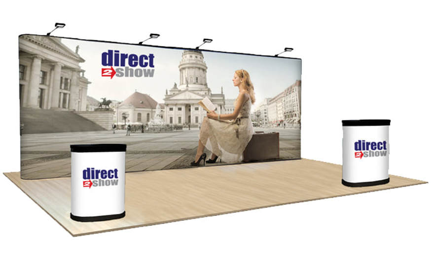
Tips to Follow to Make Your Pop-Ups Pop A Little More The entire purpose of pop up displays is to capture the attention of people through sight. There are so many details that need to be taken care of when you want to make sure that the pop ups pop! The primary goal that you will be striving to achieve is of course visual appeal. You want to make sure that the visual pop up display is attractive to the eye. However, there are so many other things that you pop up sign display needs to be. Here are a few tips that you must follow in order to capture the attention of people with the pop up sign displays. Tip # 1 – Make sure your pop up display is interactive Your pop up display sign should be interactive and communicative. A pop up is not only colors and images but it also requires to be extremely meaningful. Hence, the pop up display needs to send out a clear message to the audience. People should be able to interpret the meaning of your product or service through the display. It needs to be very clear in the information it has to offer. Tip # 2 – Never make the display sign too complex The pop up should be attractive but in order to be attractive, don’t make it overly complex or intricate. This is not something that you should go into much detail with. In fact, you should be doing the opposite – keeping things simple and meanings precise. Some people have the misconception that in order to make the pop up stand out, you need to put everything over it. Simplicity is however, the golden rule you need to follow. Tip # 3 – Make sure your pop up gives away the right feeling Did you know the pop up display can actually be comforting or overwhelming for the viewer? You heard that right. A simple pop up sign can make the viewer feel a certain way. You need to make sure you hit the bull’s eye and make the audiences feel peaceful and content with what they see on the sign display. Don’t make the sign too cluttered neither leave it too empty. Tip # 4 – Make the font readable and visible The font should be readable and this is a must. Most advertisers don’t realize how important it is for the content published on the sign to be readable. You might get a little carried away with putting everything sparkly, colorful, bright or large sized over the display. However, you need to make sure that your creative play with images and colors do not overpower the font. It needs to stay readable. Posted by Randy Blakeslee - GetnSocial |
Quantum Sign CorpWe bring life and lights to signs. We would love to share our news with you. Archives
January 2020
Categories
All
|

 RSS Feed