 There are important design principles for creating sings that attract customers for your business. Let Quantum Sign Corp guide you through this difficult process.
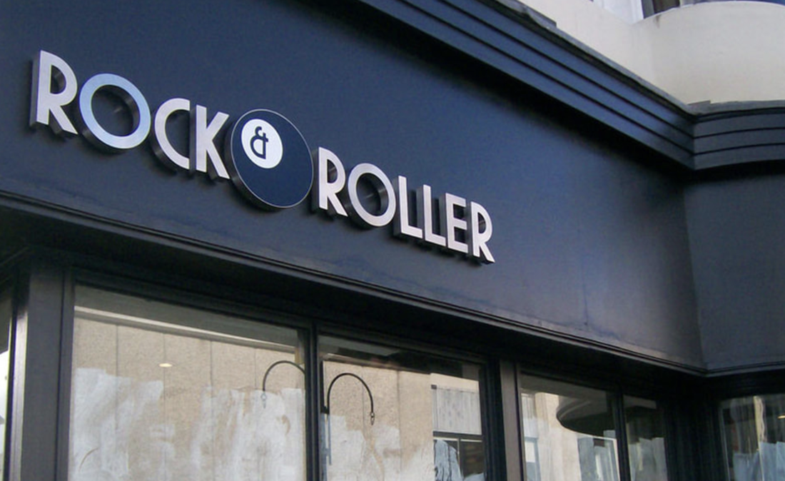
Most newcomers in the business world consider marketing and advertisement to be just online and mobile. But the truth of the matter is that sometimes a good attention grabbing sing can do wonders. According to a survey carried out by the FedEx Office, businesses especially smaller ones find signage and graphics to be more effective in client acquisition. The study was carried out on 500 businesses in the US. It showed 64 % of businesses were millennial owned with a preference towards graphics and signage. On the other hand, baby boomers preferred simplistic designs for their businesses. Regardless of one’s preference, the design of a sign gauges the businesses ability to attract and acquire new customers. Sapna Budey, director of International Sign Association for strategic initiatives once said, “Who hasn’t been driving down the street, stopped at a store and made a purchase merely because they saw the sign?” According to Budey business owners need to give close attention to design elements like color, contrast and size to make it compelling. 1. COLOR CHOICE: Color is the essence of sign’s design. It can stand for different value propositions of a business. It also reflects brands identity in the market. Imagining Coca Cola and McDonald’s brand would automatically pop up their colors in one’s mind. So, it should be taken special care of while making design decisions. Budev points out that 80% of recognition of trademark comes from its color. So do not choose random or trending color but rather think long term while choosing color for your brand. 2. CONTRAST: It is a key factor for making sign readable. Contrast sets apart foreground with background. The more the contrast, the better the readability. While applying the concept of contrast, it is important to take the surrounding of the sign placement into consideration. For example, if the sign is placed in an evergreen environment, then it is not wise to use green color for the sign. Things that can be done if the color choice is restricted, like using black or white borders to set things apart visually. The letters must be also depict contrast with the background. There are industry standard for letter lines and word count. A general rule of thumb is that if the lines are more then the word count will also decrease. This is all done in order to have well sized fonts that get the message across in a few seconds. San serif fonts are commonly. The reason behind it is simple, don’t let serifs of fonts affect the visibility of the sign. All in all, contrast plays significant role in design decisions ranging from size, word count, color choice. 3. SIZE: Signs and size go hand in hand. The bigger the sign, the more people will see it. The more people get your message, the more conversion. There is no rocket science. It’s just that size matters because eyes can just see so long. But one shouldn’t go overboard with it. Take consideration at the situation, event and surrounding to determine whether the size factor is destroying aesthetics, looking awkward or becoming an eye sore. These design principles for creating sings that attract customers will help you in making better decisions for effective business growth.  QUANTUM SIGN CORP TOP 5 THINGS TO LOOK FOR IN DESIGN. Ok. You have a great idea for a new business. You get funding, find a location, build a website. Getting the best sign should be a piece of cake, right? Think again. There is a science to creating the best sign for your business.. This article will help you avoid 5 most common mistakes when buying a sign. 1. Wrong Material Some people think the most expensive materials will make the most impressive signs. This is not always the case. You could be paying a premium for material that may not hold up as well as a cheaper material. Case in point, aluminum and stainless steel letters look very similar but aluminum is a fraction of the price of stainless steel. Also many people like the look of wood but if the wrong wood is chosen or if it is not treated properly it could rot or even be a risk for falling and injuring someone. In this case, a synthetic material like PVC would be a better option. 2. Color Contrast Another common mistake is not choosing the correct color combinations. You may remember from school that there are complementary and contrasting colors. The goal of a sign is to standout and capture the eye. This is why it is important to use contrasting colors. There is a reason why traffic signs are mostly made of a yellow background and black lettering. This combination is one of the most easy to see from a distance. I am not saying all your signs should be yellow and black but colors should be contrasting. 3. Font Selection Often people choose the wrong font when purchasing a sign. Fonts that look like script or use fancy serifs are not a good choice for signage. Readability is paramount in effective signage. I suggest sticking to block letters. Serifs are not just difficult to read but they can also dramatically reduce how your sign can be produced. 4. Size Always measure where a sign will be installed. There should be balance of negative space around the sign itself. Letters should be spaced evenly. The sign should be the right size so it is most viewable for the intended target audience of the sign. 5. Location You may have installed your sign in the winter but when the weather gets nicer and the trees start to fill with leaves your entire sign can be blocked. Also you should consider who is the target for your sign. Is it a pedestrian? Is it a driver? Put yourself in their shoes and practice approaching your business as they would. Give our team a call today and work with some of the best in the industry to help you stay current with products, designs, and within code. 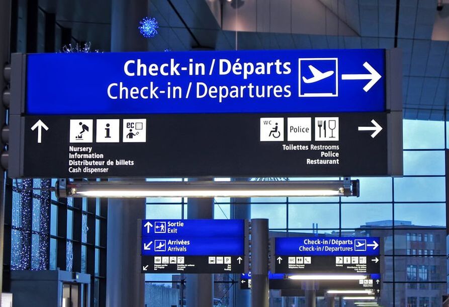 As a business owner, chances are good that you are in need of business signs for your Illinois business. There are a lot of different types of business signs to consider, and each of them offers different functions. Here are some tips on where to put several different types of signs on your property and in your building to promote your business as effectively as possible. Location Signs If you have a large building which can be challenging to navigate, you might want to get a quote. For example, adding a "you are here" quote signs along with a map helps people find what they are looking for. Having these signs could reduce the amount of time that your employees spend helping people find the place where they need to be or the items that they want to purchase. Location signs can also be placed near stairs, escalators, and elevators. For example, a sign could show areas with arrows so that people go in the correct direction. Wayfinding Signs When you choose to get wayfinding business signs in Illinois, these could be placed in several areas. If you have different parking spaces for guests versus employees, use wayfinding signs to show that in the parking lot. You may also want wayfinding signs to direct people to the restrooms or particular areas of a store, such as a customer service desk or another place that your visitors often frequent. Disability-Compliant Signs When your facility is open to the public, you need to have signs that are compliant with the Americans with Disabilities Act (ADA). The ADA-compliant signs for your building’s entrances and exits will help people with low vision or blindness figure out where they need to go. For example, those signs could have Braille on them. These signs need to be placed at a particular height in order to be useful to the people who visit your business and have a disability. Make sure your business signs in Illinois are ADA-compliant. 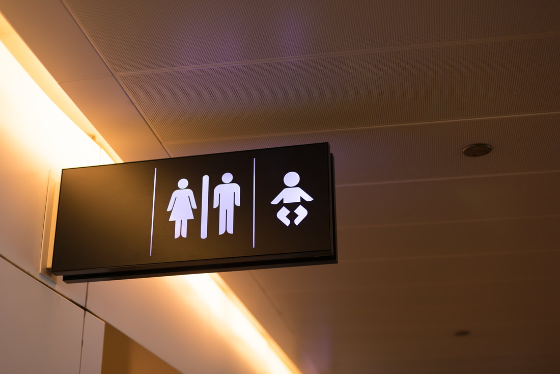 When a lot of people come to your facility, your staff could spend an inordinate amount of time giving out directions. At a large facility with many parking lots, elevator banks, waiting areas, restrooms and more, it is important to have clear and concise wayfinding signs. When you are ordering customized wayfinding signs in Illinois, consider ordering them specifically for these places at your facility.
Outside Elevator Banks When people disembark from the elevator, they need to figure out where to go next. Wall or hanging signs that use arrows to direct people as to which way they need to go make the person's visit to your facility more pleasant. In most cases, the suspended directional signs can function as a supplement to a wall-mounted sign or cabinet sign near the elevators. If you have signs placed anywhere in your facilities, you need to have them outside elevators to help direct people where they need to go when they disembark from them. Near the Restrooms Another place in your facility to put the wayfinding signs in Illinois is near the restrooms. The bathrooms are one of the most commonly needed parts of your facility. You may wish to have both hanging directional signs as well as ADA compliant signs posted on the wall. These signs will reduce the number of times that your staff has to help people find the bathrooms. In Driveways and Parking Lots Expansive facilities often have multiple entrances, exits and parking areas. If your parking lot has separate areas for employees versus patients or visitors, use directional signs to show where people should go. For example, a hospital might have a directional sign that shows where to go for emergencies, where to go for employee parking, where patients should park and where visitors should park. If you have an entrance for employees only and a different one for guests, directional signs facilitate traffic flow.  As a business owner, chances are good that you are in need of business signs for your Illinois business. There are a lot of different types of business signs to consider, and each of them offers different functions. Here are some tips on where to put several different types of signs on your property and in your building to promote your business as effectively as possible.
Location Signs If you have a large building which can be challenging to navigate, you might want to get "you are here" signs along with a map. This helps people find what they are looking for. Having these signs could reduce the amount of time that your employees spend helping people find the place where they need to be or the items that they want to purchase. Location signs can also be placed near stairs, escalators, and elevators. For example, a sign could show areas with arrows so that people go in the correct direction. Wayfinding Signs When you choose to get wayfinding business signs in Illinois, these could be placed in several areas. If you have different parking spaces for guests versus employees, use wayfinding signs to show that in the parking lot. You may also want wayfinding signs to direct people to the restrooms or particular areas of a store, such as a customer service desk or another place that your visitors often frequent. Disability-Compliant Signs When your facility is open to the public, you need to have signs that are compliant with the Americans with Disabilities Act (ADA). The ADA-compliant signs for your building’s entrances and exits will help people with low vision or blindness figure out where they need to go. For example, those signs could have Braille on them. These signs need to be placed at a particular height in order to be useful to the people who visit your business and have a disability. Make sure your business signs in Illinois are ADA-compliant. |
Quantum Sign CorpWe bring life and lights to signs. We would love to share our news with you. Archives
January 2020
Categories
All
|

 RSS Feed